More Case Studies:



Lets create together.
Because nothing great is ever built alone.
Feel free to send me an email or connect with me on linkedin!
connect
about me
fun stuff
Alexandra
made with 🫶 & gratitude in Vancouver, BC
© Alexandra Smart 2026
CASCADIA SKINCARE
Redesigning Cascadia's
ATC Flow.
Evaluating Cascadia's ATC flow.
Creating measurable
design goals.
To make sure the final design aligns with the business' needs,
I wanted to create some goals to make sure my solutions
addressed the outlined pain points.
I wanted to assess the current user flow, to gain a deeper understanding of what the add-to-cart / checkout process was like. Turns out there were a lot of moments where i was looking for a function, like a delete button - and there was none.
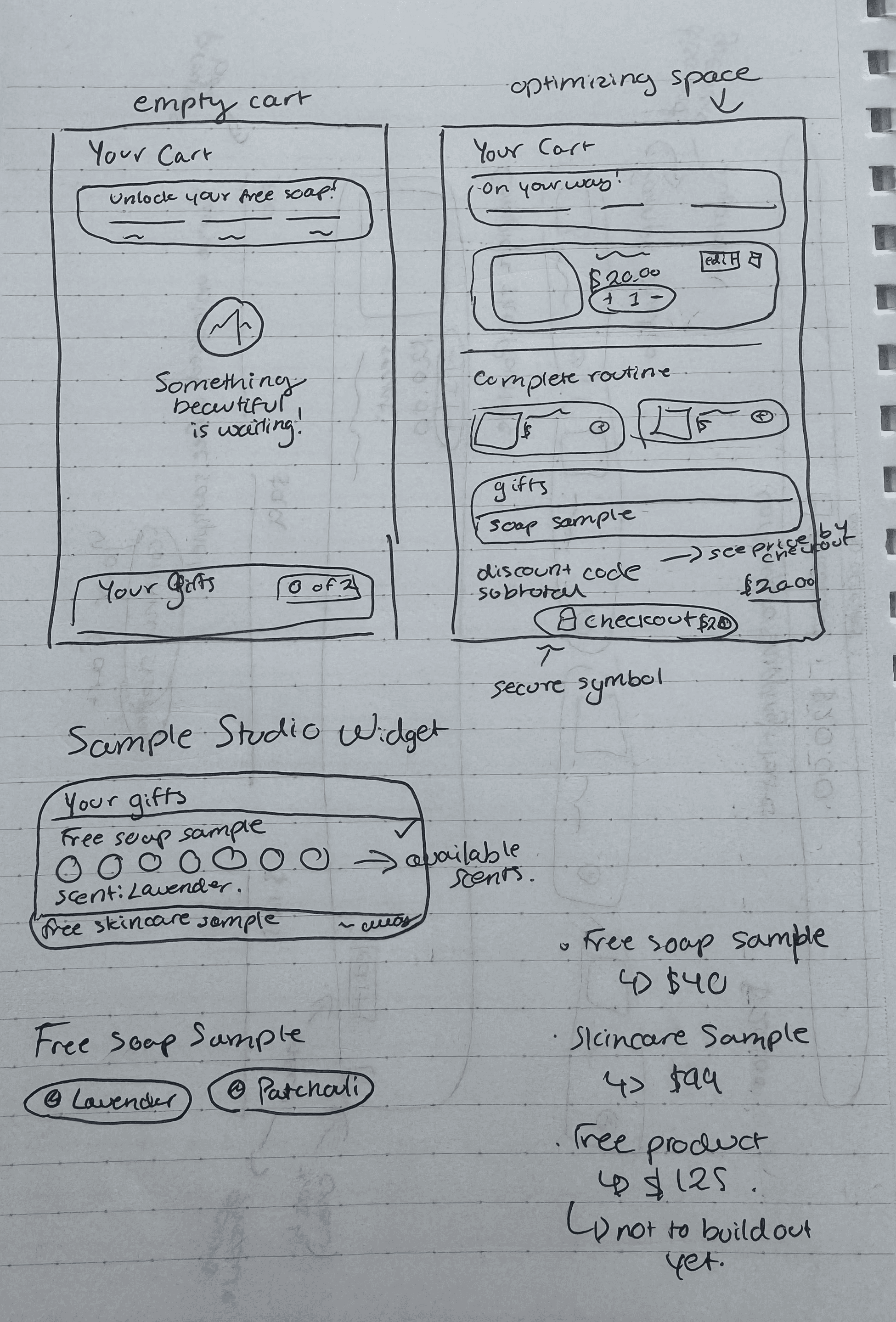
I really love to sketch out my designs first. I looked at many other shopify skincare / beauty sites of companies of whom I admire their websites, and I tried to take what was working from their designs and apply it to our own cart.
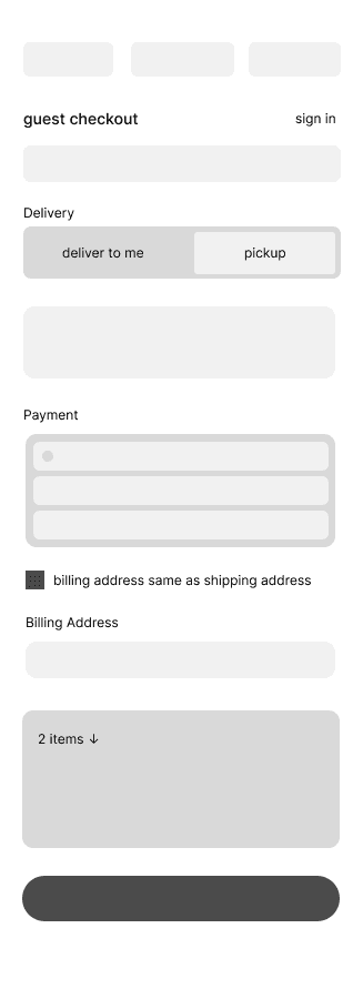
In figma, I created a few wireframes to start seeing the vision come to life and also start assessing what I would systematically need to build - what was the foundation, and what was the icing on the cake?
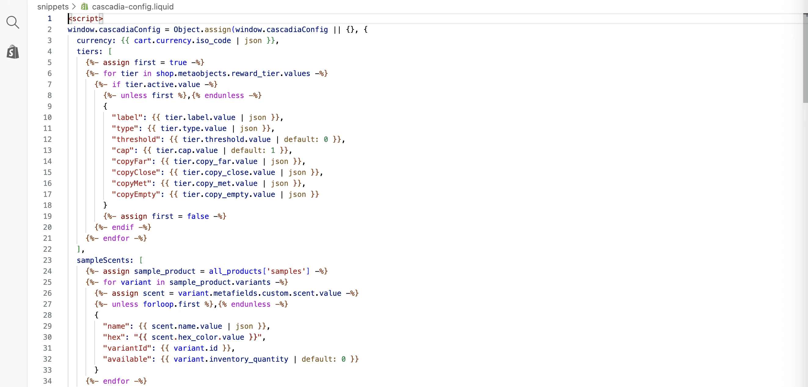
In my time working on this site, I have learned so much about coding and how to personalize a site - without overloading it. This is some code I was building with the help of Claude for the sample studio to be fleshed out!
What was cool for me (but also stressful) was the little tweaks that were immediately needed after implementing. There are some states and contexts that just don't cross your mind when designing, as well as setting this new flow up for the scalability my boss wanted.
I'm very proud of the final product! The entire process took me around one month. Now, I have established, scalable and adaptable systems to handle all types of users and products that traverse the site.
Impact
Overview
Cascadia is a local wellness and skincare startup that prioritizes natural and botanical-driven internal and external health.
Masked by a loyal customer base, the add to cart system, which every user passes through, was a default, untouched
shopify cart that was contributing to the dissolution of user trust and ease of experience. My role throughout this project
juggled user research, product design, ui design, as well as analytics & testing.
Roles
Checkout Completion Rate
+19.6%
+14%
Conversion Rate
UX Researcher
Product Designer
Timeline
4 weeks
The step most impacted by the redesign.
Building trust through design was the mechanism for
our conversion rate goals.
Measured across matched 4-week windows, before and after launch, excluding initial implementation phase.
Company
Cascadia Skincare
Tools
Figma
Claude
Shopify
2
3
1
The Problem.
Cascadia had a default shopify cart that was starting to fail under the weight of scalability, and looked
sort of dysfunctional compared to the rest of the site, which was a high barrier for entry for new
customers.

Increase user trust
through intuitive and
positively reinforced
design systems.
Keep familiar indicators,
structure and feedback
for longer-time
customers.
Integrate interactive
conversion features to
increase cart size.
Lo-fi -> Mid-fi Wireframes
4


mobile
desktop
before
proposed
Sketching out a new cart
6
Designing the new Cascadia Cart
7
Post-ship issues and solutions
9
Impact
10
Reflection!
Browse
Add To Cart
Cart Opens
Edit Cart
Proceed To Checkout
Browse
Add To Cart
Cart Opens
Edit Cart
Proceed To Checkout

5
product page
no confirmation shown
plain, default template
decrement to zero to delete
dicsount reads like an error
product page
confirmation + microcopy
branded, rewards & samples
delete + edit buttons
trust badges, live totals
8
Final Designs

Still open: getting people into the cart in the first place. Reached-checkout rate dipped slightly even as everything downstream improved - proof that this problem now lives earlier in the funnel than the cart itself. It's a systems and flow problem, not a component one, and it's the next thing I'd solve if I kept iterating.
Still open: scalability. This project taught me, concretely, how many parts of a business a single component like a cart actually touches. It's not an isolated interface — it's a chokepoint every customer passes through. Handing this off responsibly means making sure there's no margin for a kink or bottleneck as the business scales past what I can personally watch over.
The bigger shift this project caused in me goes beyond the cart itself. For a while, I thought of UX and design, web design - as something you use to enhance business, something you design around business. Now I understand that design is the business. The UX of the site is the store. My background in media theory and HCI taught me about interfaces, that the interface you're given is how you perceive the world, how you perceive reality. So the interface people are given for a site is how they come to think of the brand. Just like the cart, the entire process and function of any company needs an interface that delivers - one that's accessible, intuitive, and a true reflection of the kind of organization you are.
That's not a design principle I'm reciting. It's the actual mechanism behind every number above.
I measured across matched four-week windows before and after launch: excluding the initial bug-fix period, so these numbers reflect the redesign itself, not an unstable rollout.
Checkout completion: 46.6% → 55.7% = a 19.6% lift.
This is the number that matters most, because it isolates the exact step the redesign touched. It's not a vanity metric riding on broader traffic growth, it's direct evidence that removing friction at the point of highest doubt converts hesitation into action.
Overall conversion rate: 1.63% → 1.85% = a 14% lift.
Cart additions: +10%. Sessions: +4%.
Together, these numbers tell a specific story: growth in traffic and cart activity was modest, but growth in follow-through was not. That gap is the signature of a trust problem being solved, not a traffic problem. My boss asked for a conversion lift. What the data shows is that trust was the lever that produced it, not a nice-to-have layered on top of the real work, but the mechanism itself.
The sample studio was
very hard to understand
what scent you were
actually choosing -
needed clearer visuals.
The site was really slow.
There were too many
overlapping functions
reading the cart,
slowing it down, which is
arguably very hurtful
for conversion! Solved
by simplifying coded
pathways.
Something small I had
missed was having a +/-
on the samples - people
could add more, which we
didn't want! For all
samples, I gated the
quantity selector to
only regular products.